Youtube is known primarily for shorter-form videos that can be posted by anyone- from amateurs to professional video production companies both big and small. I wanted to examine the factors that make some videos more successful than others. One measure of the success of a video is how many views a video has received.
I’m going to examine the relationship between some numerical and indicator variables and the response variable Views by performing a multivariate analysis on a set of data I gathered from Youtube. I used R for my analysis, and have posted the code and data set here.
I focused on a single content creator, Viacom, a major media conglomerate known for its traditional linear television channels, which include MTV, Comedy Central, and VH1, as well as the movie studio Paramount. I wanted to examine how Viacom, a newer player to the online video space, performs in this space lately, and what drives its performance given the available data.
I limited my pool of data to all the videos posted by Viacom brands on a single date, March 18, 2016. All data was gathered on March 26, 2016 at approximately 8-9 PM to get about a week’s worth of viewership data. The Viacom brands with official Youtube channels are: MTV, MTV2, MTV News, Comedy Central, MTV International, VH1, Logo TV, Spike TV, TV Land, Nickelodeon, BET, Paramount Pictures, mtv braless, Lip Sync Battle on Spike, Belator MMA, and South Park Studios. There were 30 videos posted to these combined channels on March 18, 2016. From each video page, I gathered data on the following variables:
| channel |
| video_title |
| views (number of) |
| number_channel_subscribers |
| video_length (in seconds) |
| number_comments |
| comedy_clip (0=no, 1=yes) |
| female_target (0=no, 1=yes) |
| likes (number of) |
| dislikes (number of) |
I will focus on the views variable as the response, with number_channel_subscribers, video_length, number_comments, comedy_clip, female_target, and one other variable as the predictors. I calculated a ratio variable of likes_to_dislikes to get a sense of viewer reactions to videos:
| Likes_to_dislikes = likes / (dislikes + 1) |
I assume that the individual variables of likes and, to a less predictable extent, dislikes would tend to increase along with video views. This would make likes and dislikes less interesting to consider as predictors. On the other hand, the ratio of likes_to_dislikes keeps the information in our model, but appropriately penalizes likes through the dislikes variable. 1 is added to the denominator to compensate for the fact that some videos receive zero dislikes.
I ran some summary statistics on these variables to get a better sense of the data:
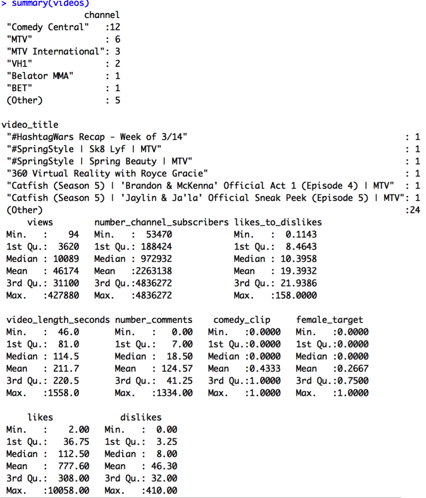
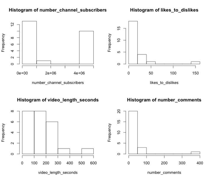
View counts range from 94 to 427,880 with an average of 46,174. Overall, it seems like this set doesn’t contain much in terms of viral videos, which get millions of views. Let’s take a look at the histograms of the variables of interest:
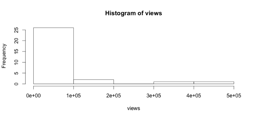
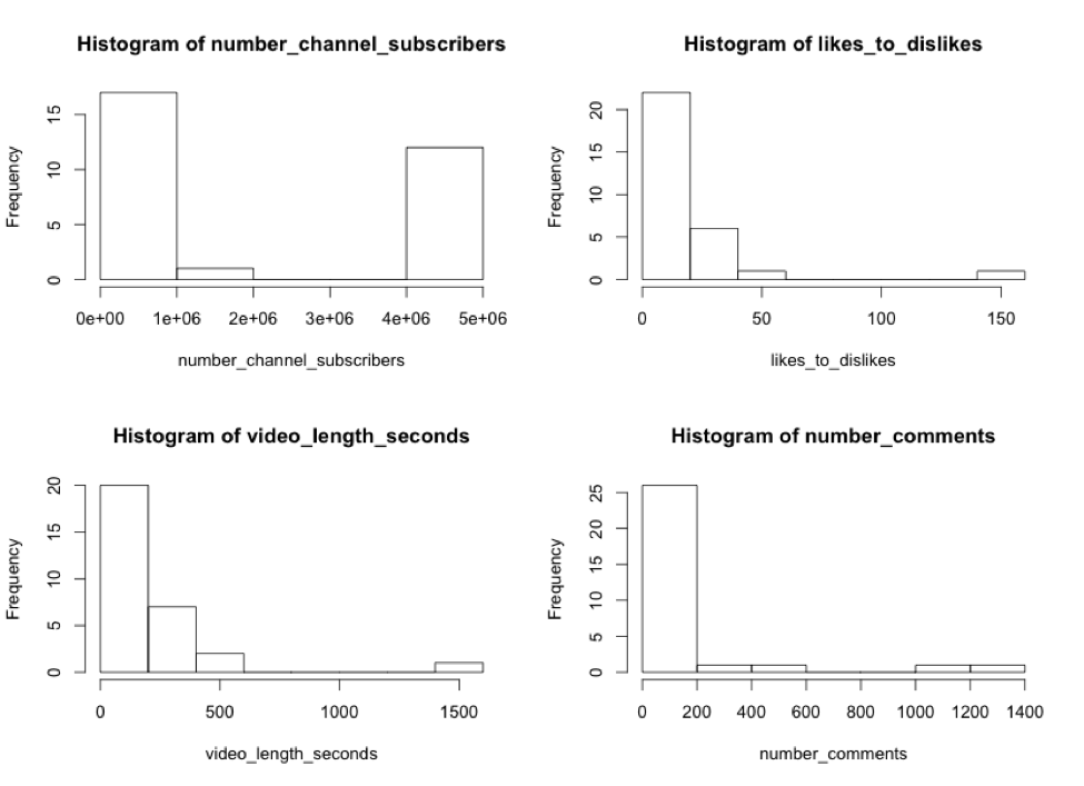
The variables views, likes_to_dislikes, video_length_seconds, and number_comments are all right tailed, suggesting it might be best to transform them into logs before performing a regression. The variable number_channel_subscribers is U-shaped, so I will take this variable and its square and add it to the regression as a parabolic function.
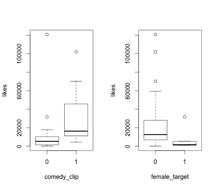
Let’s also look at the indicator variables, comedy_clip and female_target:
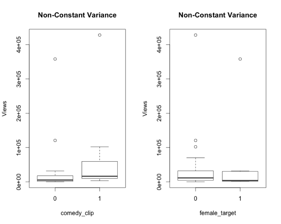
There are some noticeable differences in the variances of comedy clips and videos targeted at females vs. non-comedy clips and non-female-targeted videos, respectively. Comedy clips range more widely in views than do non-comedy clips. Videos targeted at females are more narrowly distributed than those not targeted toward females. We’ll want to take a closer look at these two variables a bit later.
I calculated logs with base 10 for each of the appropriate variables:
Log.views <- log10(views)
Log.likes_to_dislikes <- log10(likes_to_dislikes)
Log.vid_length <- log10(video_length_seconds)
Log.num_comments <- log10(number_comments + 1) #Some videos have zero comments.
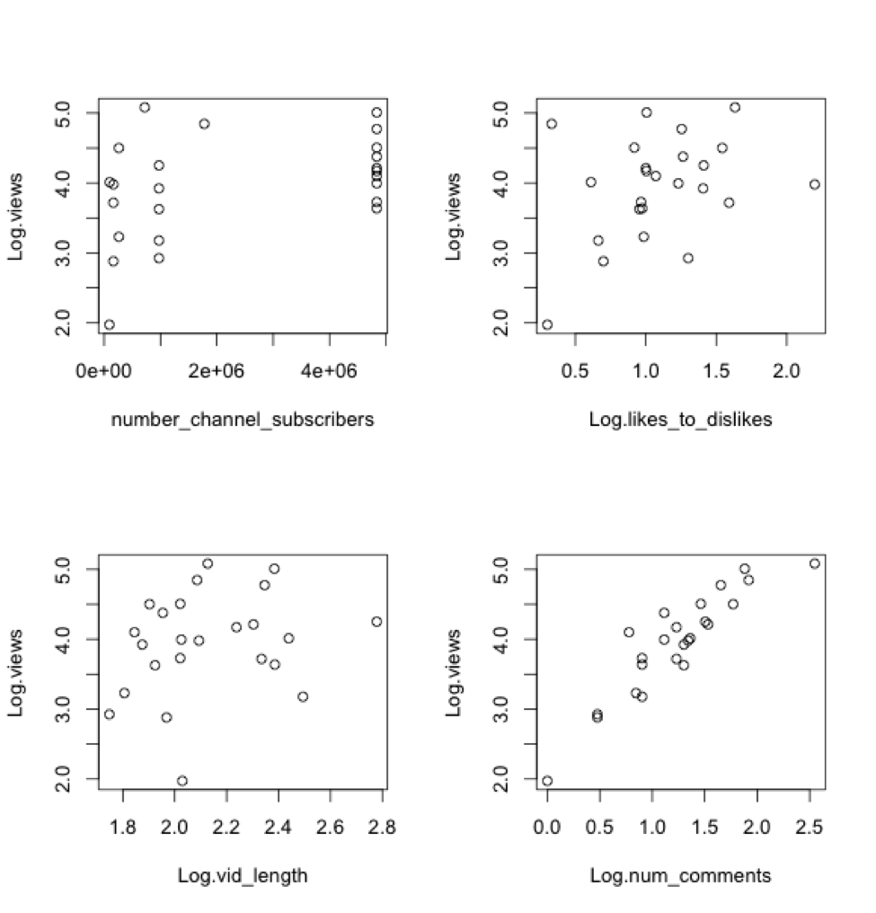
Let’s plot Log.views against each individual numerical predictor:
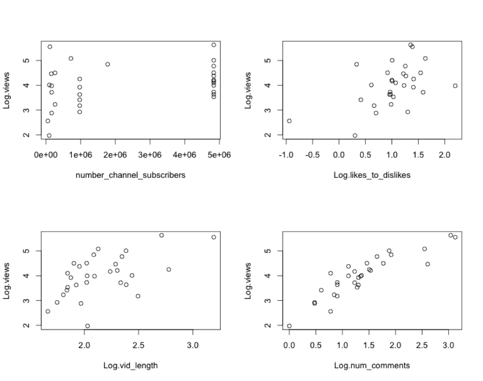
There seem to be weak, but apparent, relationships between Log.views and each of the variables. I will go ahead and perform a regression on these variables and call it Model A. The regression equation for Model A is:
Log.views = β0 + β1 x Log.likes_to_dislikes + β2 x Log.vid_length + β3 x Log.num_comments + β4 x number_channel_subscribers + β5 x (number_channel_subscribers^2) + random error
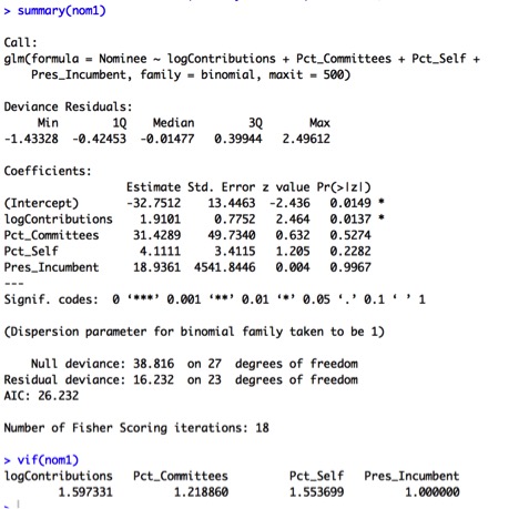
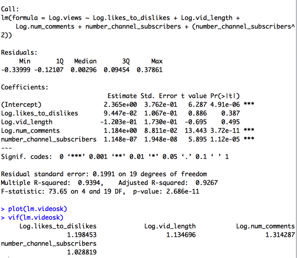
The results of this regression are:
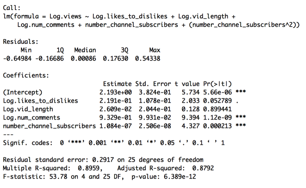
At first glance, the model appears quite good. The F-test has a p-value of < 0.001, and therefore the overall model is highly significant. The model has an R-squared of nearly .90, which is to say that 90% of the total variation in Log.views is accounted for by the model, and so this model has high predictive power. The t-test for Log.likes_to_dislikes is marginally significant, with a p-value less than 0.1, while the t-tests for Log.num_comments and number_channel_subscribers are highly significant, with p-values less than 0.001. The coefficients imply:
- A 1% increase in a video’s likes_to_dislikes ratio is associated with a 0.22% increase in video views, holding all else in the model fixed,
- A 1% change in a video’s length is associated with a .03% change in video views, holding all else in the model fixed,
- A 1% change in the number of comments a video has is associated with a .93% change in video views, holding all else in the model fixed, and
- A one unit change in number_channel_subscribers is associated with a .000025% change, or a 10^1.084e-07 multiplicative change, in views, holding all else in the model fixed.
Log.vid_length is not significant given its t-test p-value of 0.90, so we might consider taking it out later. The standard error of .29 suggests that 95% of the time the logged number of views is known to within ±.29. In other words, this model could be used to predict video views to within 51% (10^-.29) and 195% (10^.29) of our best guess 95% of the time. It seems like a fairly wide interval to say that we’re 95% sure that a video will get between half and double our predicted value, given the model.
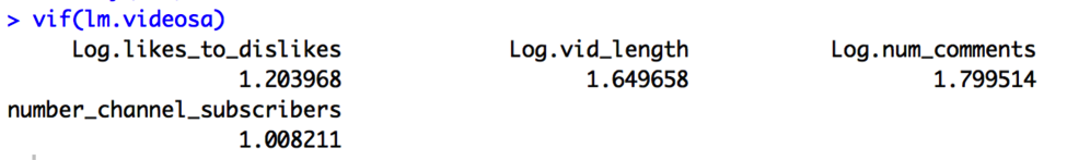
The VIFs for the variables don’t indicate any collinearity problems, as each VIF is less than both 10 and 1/(1-R2):
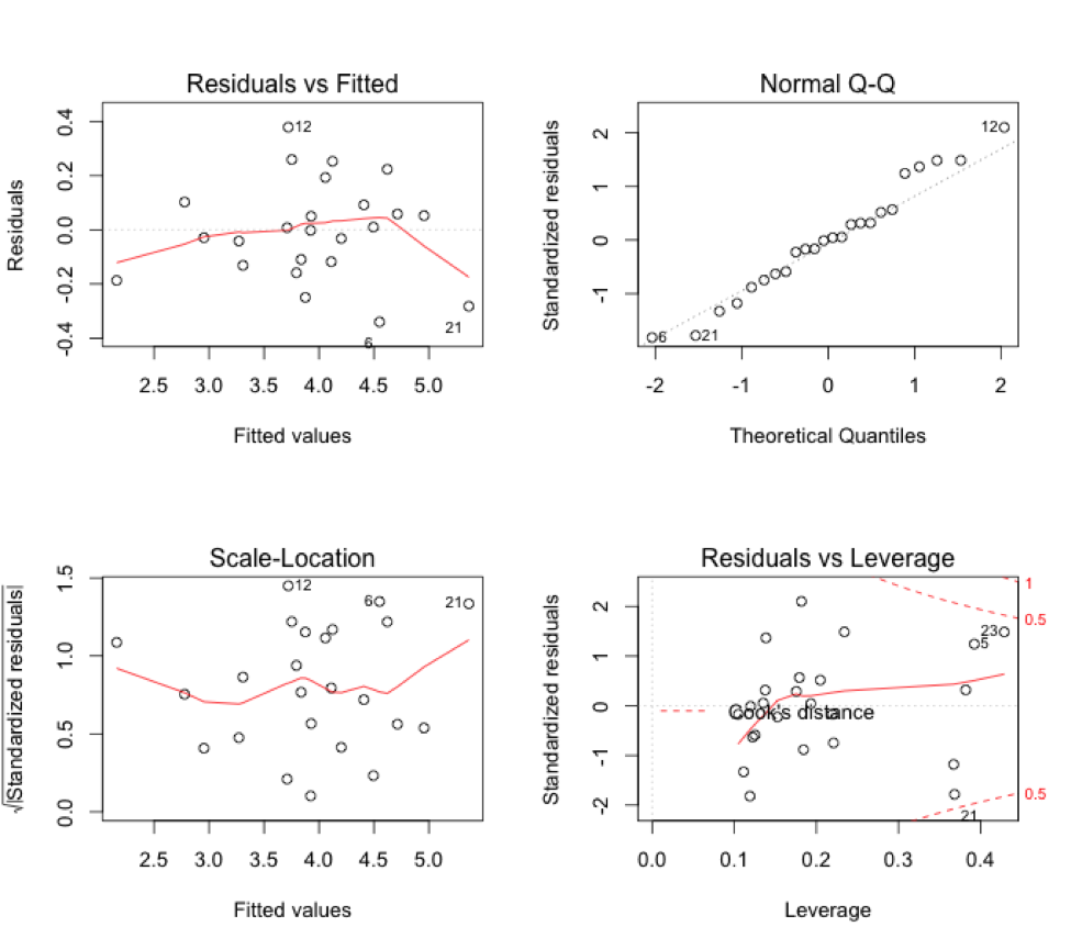
We should now check our assumptions by looking at residual plots.
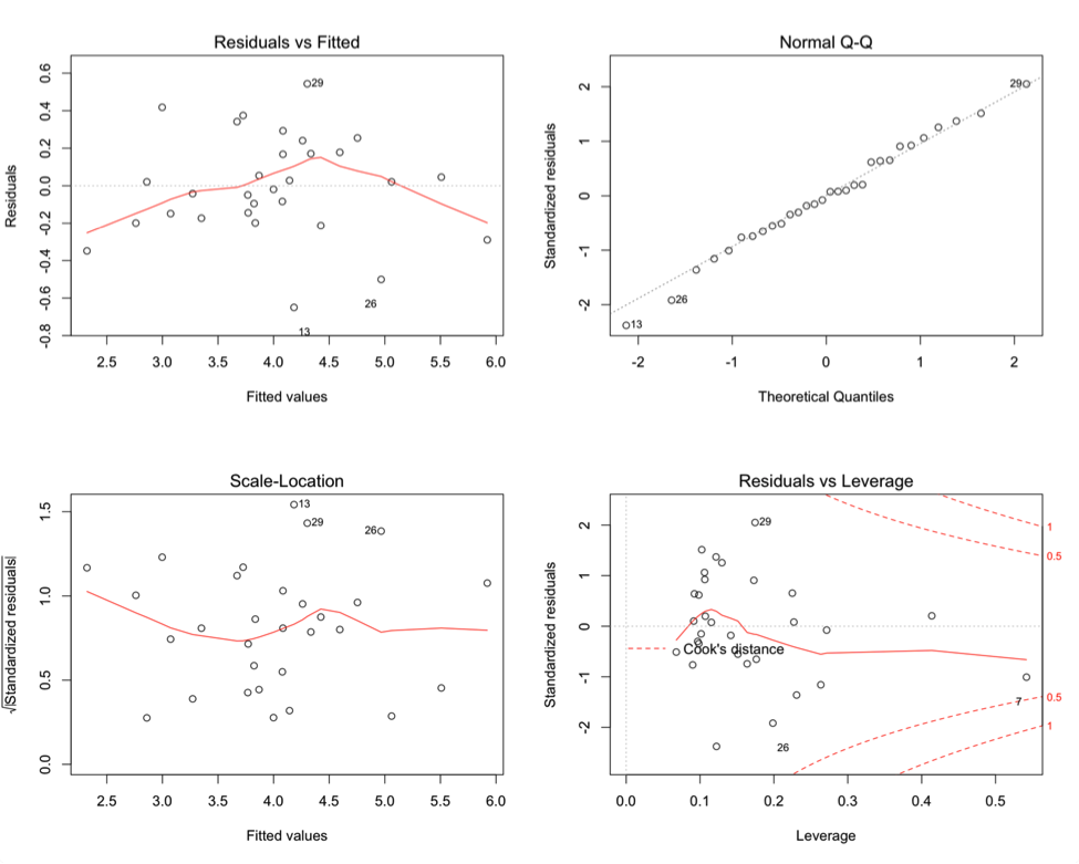
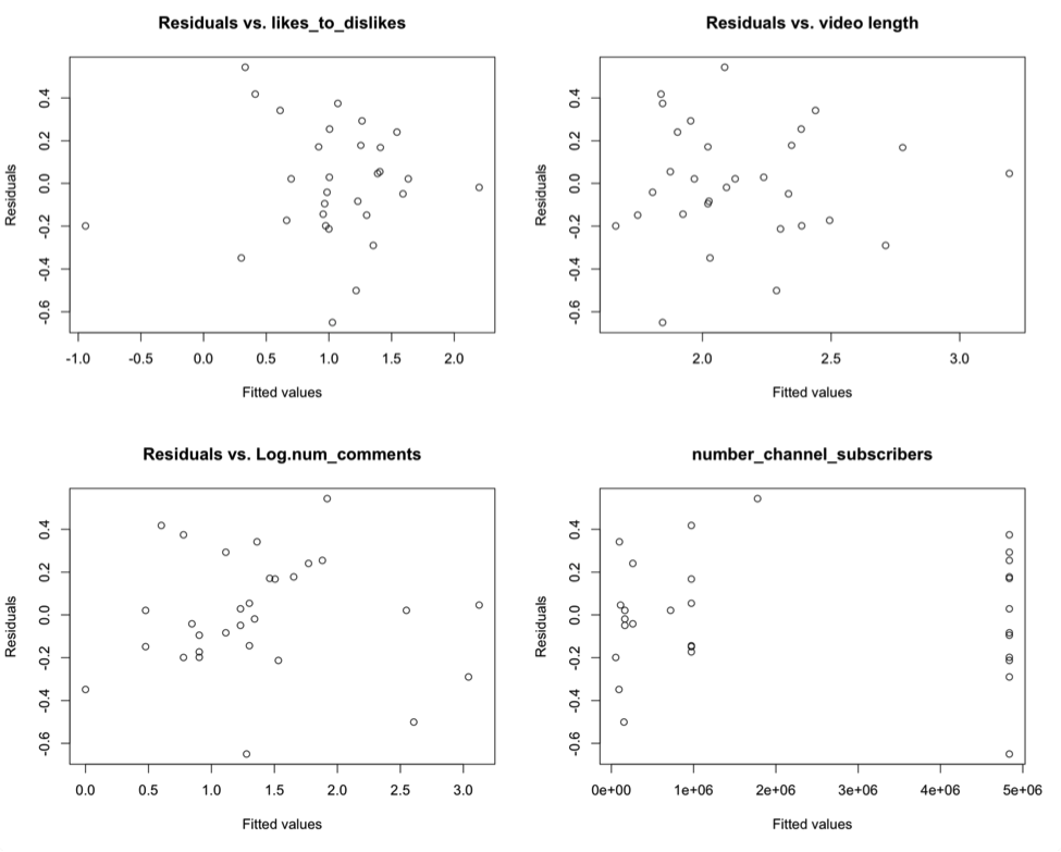
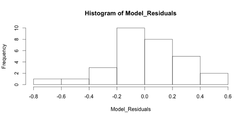
These residual plots indicate that some of our assumptions are being violated. There is structure within the residual plots, namely non-constant variance. In “residuals vs. fitted,” there’s higher variance in the middle, and lower variance in the left and right extremes of the graph. The “normal Q-Q” plot indicates there are possible outliers and the “Residuals vs. Leverage” plot shows there might be some leverage points, as well as outliers. The residuals plotted against each of the predictors seems to show structure in all but the “Residuals vs. Log_num_comments” plot, which is seems to have the fewest problems with variance. Finally, the residuals histogram is not quite normally distributed. We should address these problems by performing diagnostics on the unusual observations, and some other model selection techniques.
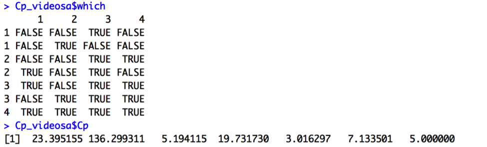
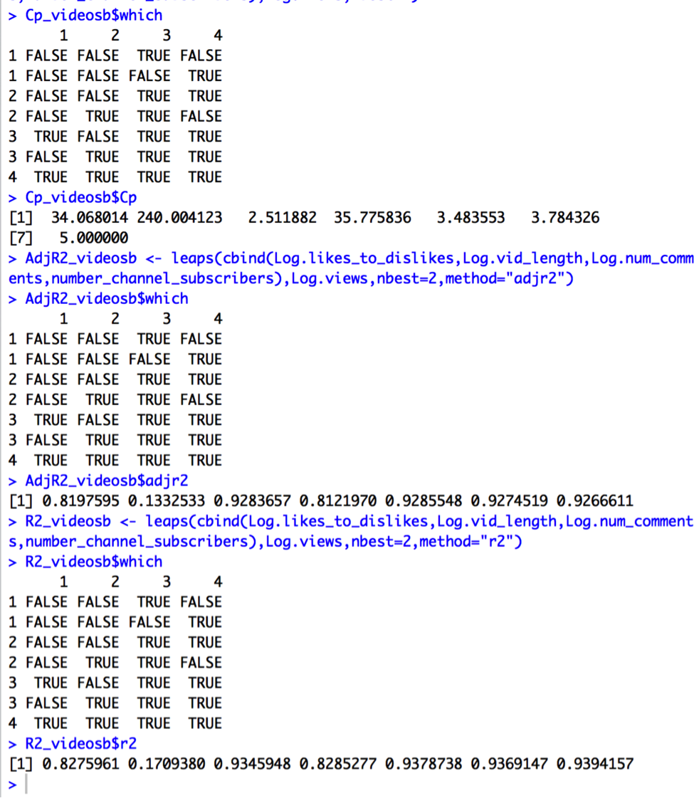
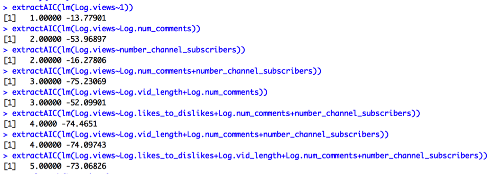
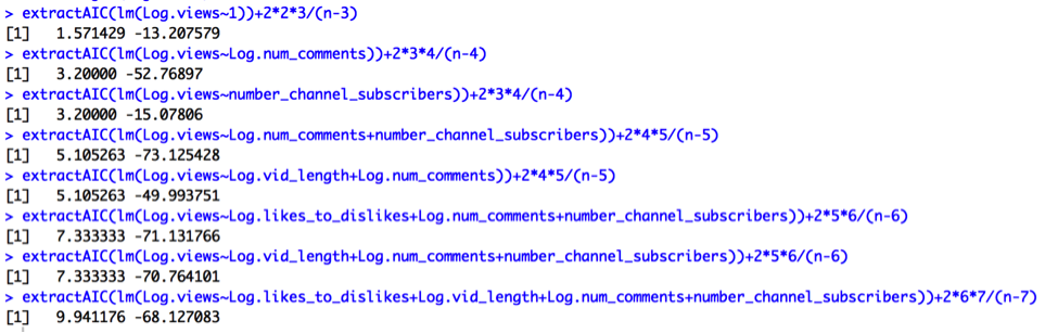
First, I will compare some potential models using the variable’s we’ve been discussing to see if the current model is overfit. I will compare models based on Cp, Adjusted R2, R2, AIC, and AIC Corrected.
Output for Cp:
Output for Adjusted R2: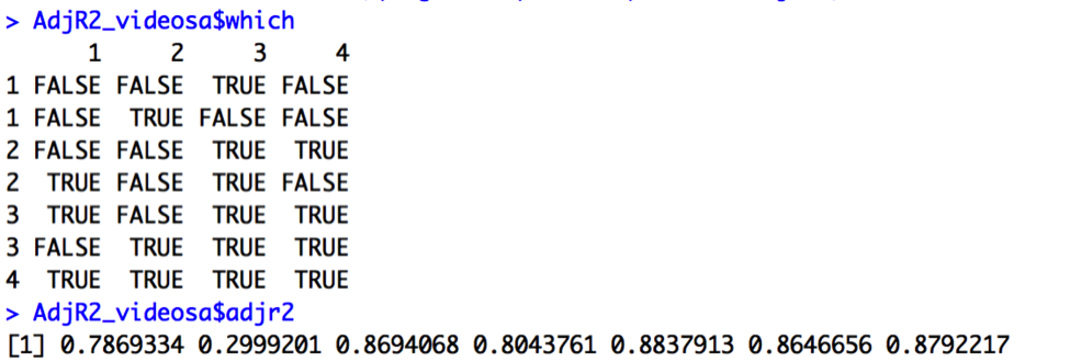
Output for R2: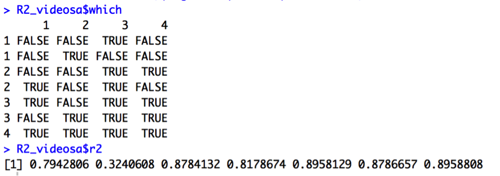
Output for AIC: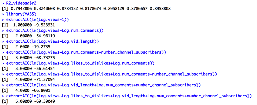
Output for AIC Corrected:
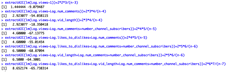
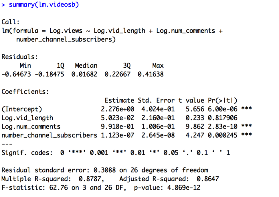
We’re looking for the simplest models such that Cp = p+1 or smaller, R2 and Adjusted R2 are maximized, and AIC and AIC Corrected are minimized. The Cp output (Cp = 3.02) suggests we choose a 3-predictor model utilizing the variables Log.vid_length, Log.num_comments, and number_channel_subscribers. On the other hand, Adjusted R2 (AdjR2=.88), R2 (R2=.90), AIC(-71), and AIC Adjusted (-69) outputs all suggest a different 3-predictor model utilizing the variables Log.likes_to_dislikes, Log.num_comments, and number_channel_subscribers. Thus, I will compare the two models:
Model B:
Log.views = β0 + β1 x Log.vid_length + β2 x Log.num_comments + β3 x number_channel_subscribers + random error
Model C:
Log.views = β0 + β1 x Log.likes_to_dislikes + β2 x Log.num_comments + β3 x number_channel_subscribers + random error
The results of Model B are:
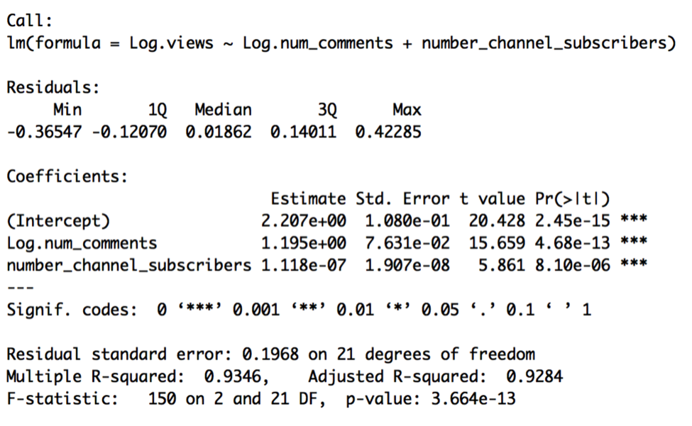
The results of Model C are:
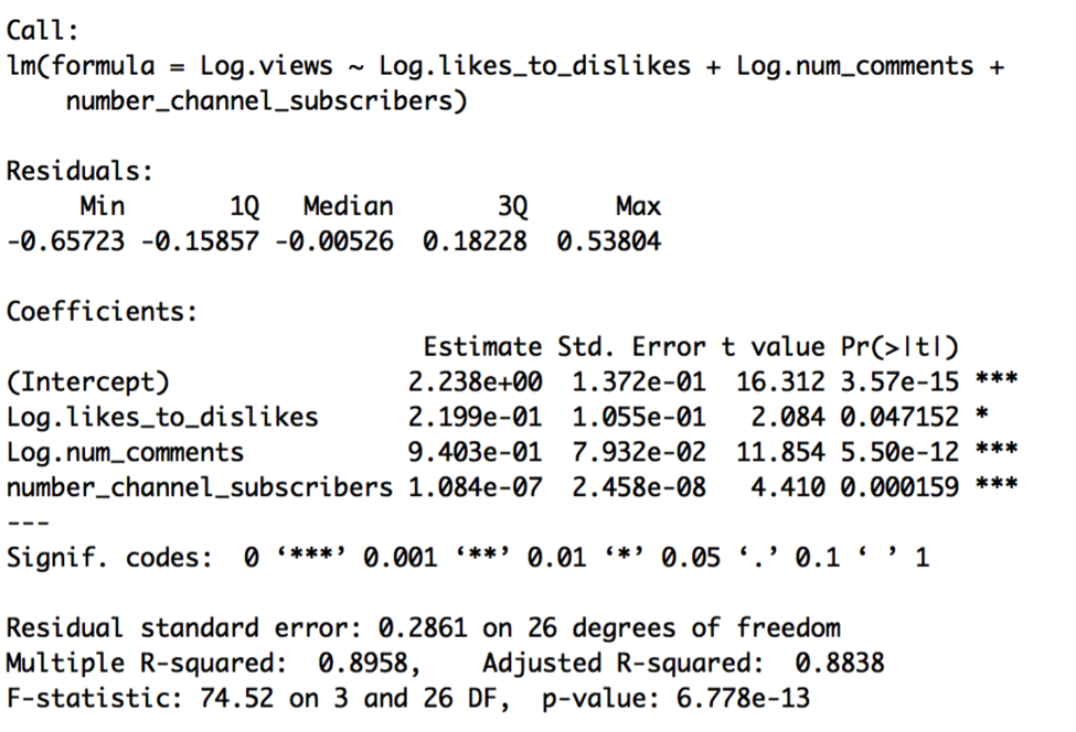
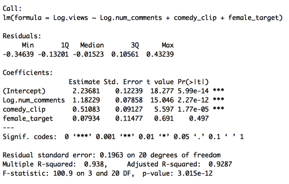
Model C is preferable, given slightly higher R2, lower standard error, and the fact that all the predictors are significant. Let’s now compare this pooled model to a constant shift model containing our other indicator variables, comedy_clip and female_target. Let’s call this constant shift model Model D:
Log.views = β0 + β1 x Log.likes_to_dislikes + β2 x Log.num_comments + β3 x number_channel_subscribers + β4 x comedy_clip + β5 x female_target + random error
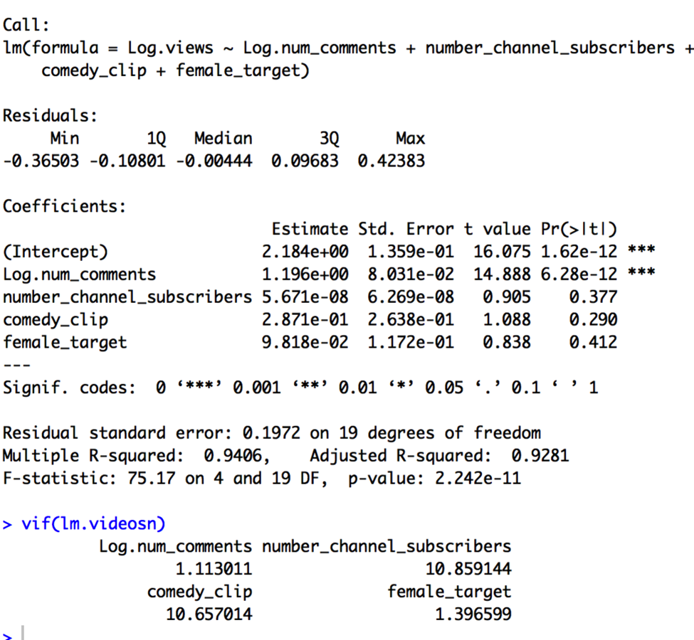
The results of Model D are:
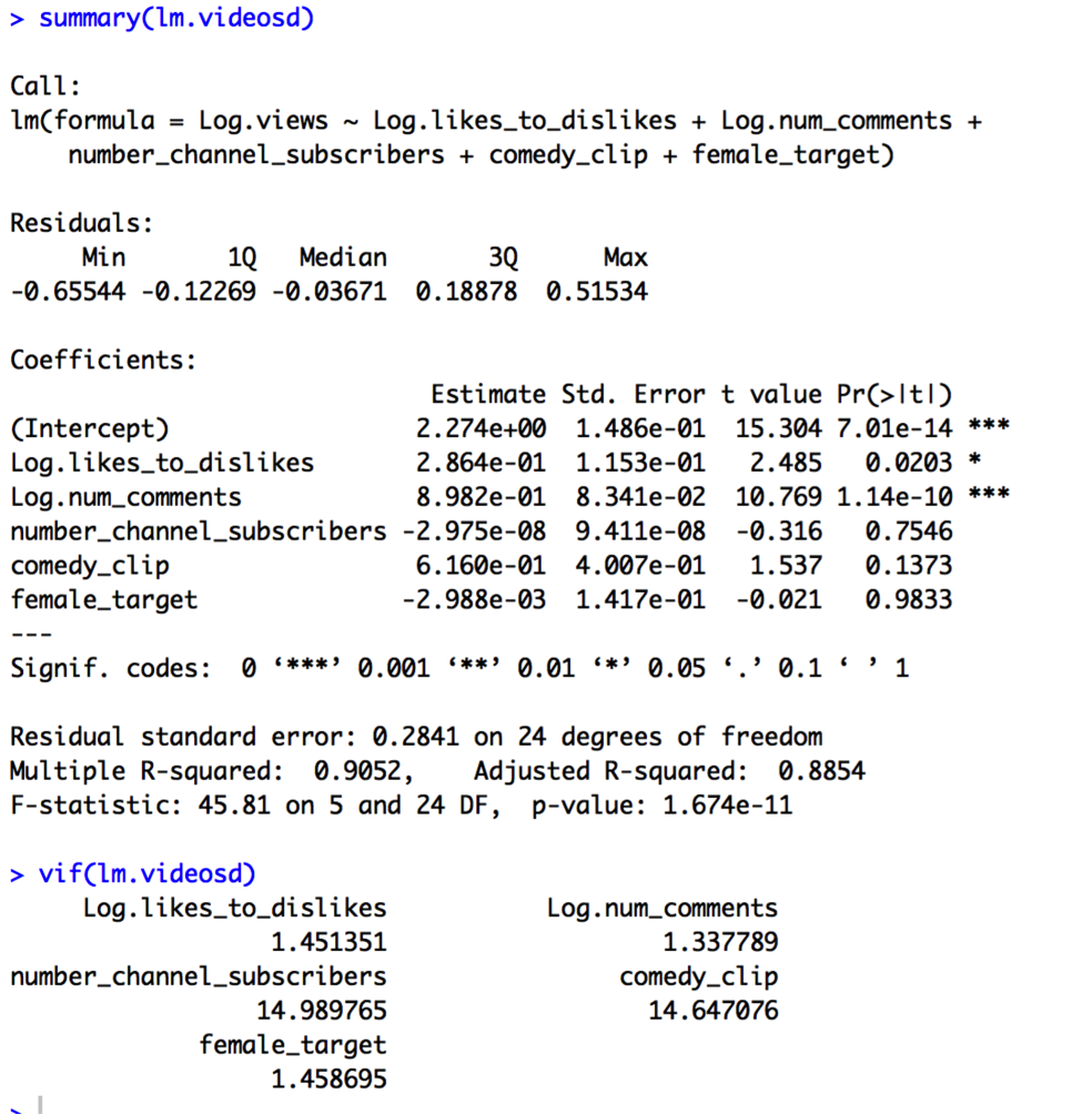
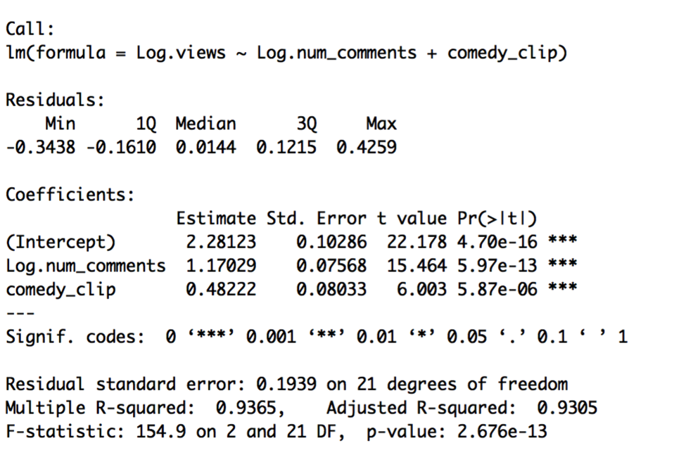
In Model D, neither comedy_clip nor female_target are significant. Notably, number_channel_subscribers is no longer significant, either. When we look at the VIF values, we see why. Number_channel_subscribers and comedy_clip appear highly correlated, suggesting we keep only one of these variables in the model. I then compare the results of Model E (containing number_channel_subscribers) and Model F (containing comedy clip):
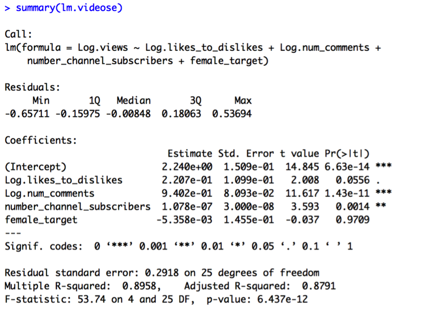
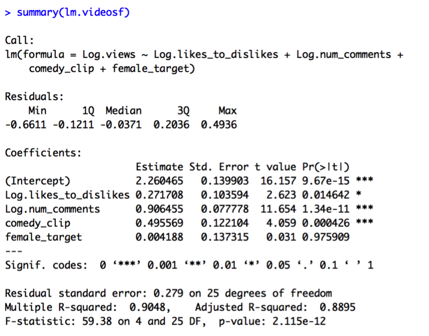
It seems that keeping comedy_clip and getting rid of number_channel_subscribers results in a better model in terms of R2, standard error, and predictor significance (all predictors except female target are significant in Model F).
Model F is a constant shift model, considered a special instance of a pooled model (Model G):
Log.views = β0 + β1 x Log.likes_to_dislikes + β2 x Log.num_comments.
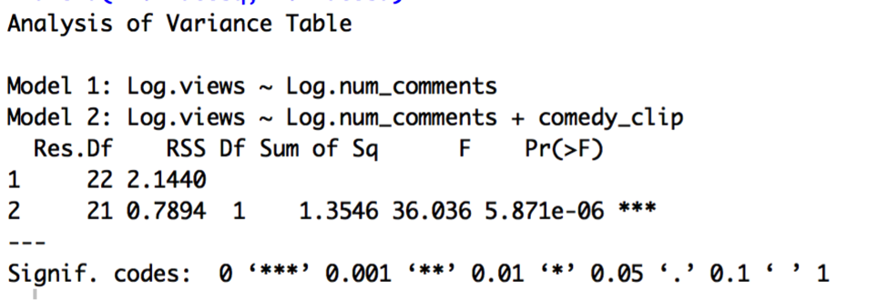
Given Model F is a special case of Model G, we can perform a partial F test to see whether the constant shift model is a significant improvement on the pooled model:
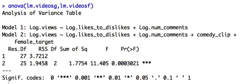
Model F does appear to significantly improve upon Model G, given the highly significant p-value of less than .001 for the partial F test.
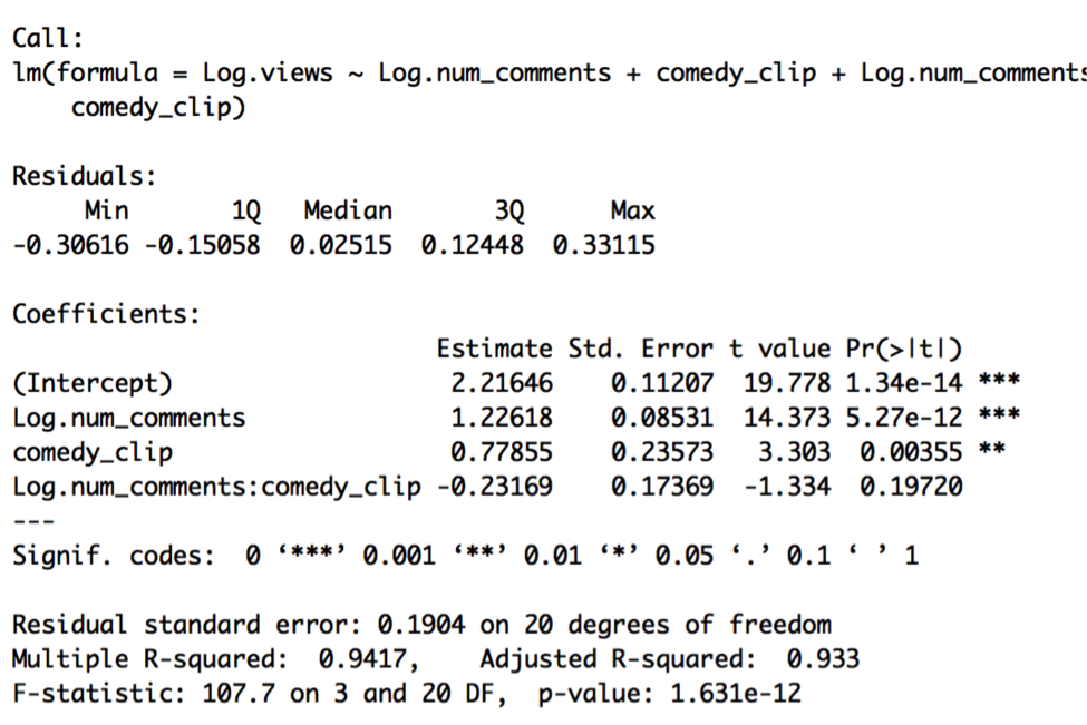
Let’s now compare the constant shift model (Model F) to the partial-full and full models:
Model H (partial-full):
Log.views = β0 + β1 x Log.likes_to_dislikes + β2 x Log.num_comments + β3 x comedy_clip + β4 x female_target + β5 x Log.likes_to_dislikes*comedy_clip + β6 x Log.num_comments*comedy_clip
Model I (partial-full):
Log.views = β0 + β1 x Log.likes_to_dislikes + β2 x Log.num_comments + β3 x comedy_clip + β4 x female_target + β5 x Log.likes_to_dislikes* female_target + β6 x Log.num_comments* female_target
Model J (full model):
Log.views = β0 + β1 x Log.likes_to_dislikes + β2 x Log.num_comments + β3 x comedy_clip + β4 x female_target + β5 x Log.likes_to_dislikes*comedy_clip + β6 x Log.num_comments*comedy_clip + β7 x Log.likes_to_dislikes* female_target + β8 x Log.num_comments* female_target
Looking at the output of Models H, I, and J, none of the t-tests indicate significance for any of the interaction effect variables. This suggests that the partial-full and full models are not significant improvements on the constant shift model. We will therefore stick to the constant shift model (Model F) for now:
Log.views = β0 + β1 x Log.likes_to_dislikes + β2 x Log.num_comments + β3 x comedy_clip + β4 x female_target
Once again, I will examine the residual plots for potential problems with assumptions:
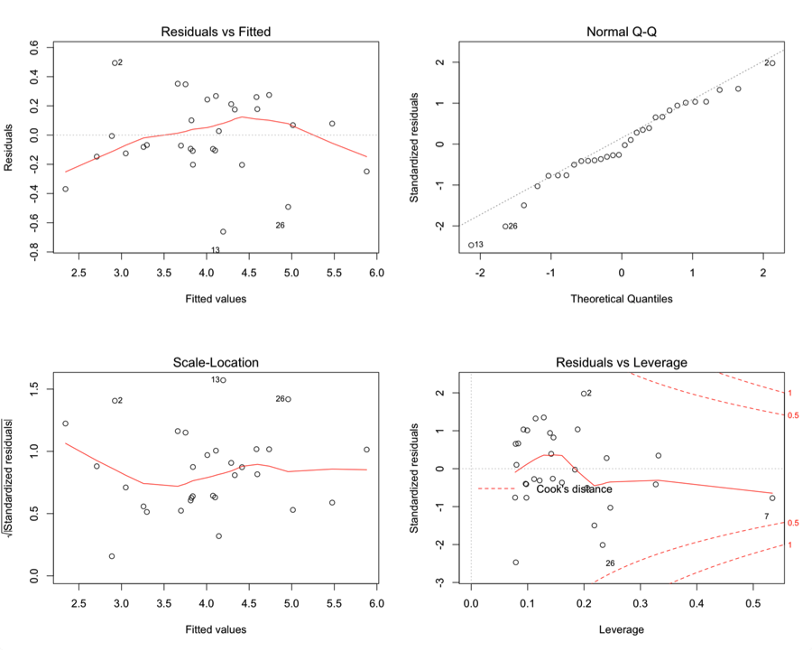
There are still problems with the residual plots, but I wonder if diagnosing some of the outliers, leverage, and influential points will help improve things.
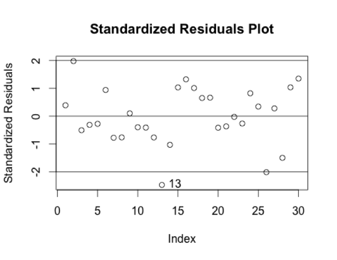
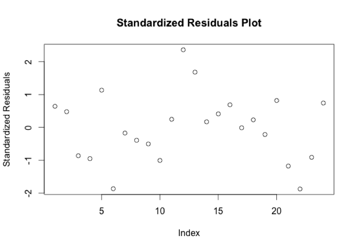
First I will calculate standardized residuals for each of the points:
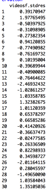
I am looking for absolute values of more than 2.5 as a general guideline to what might be an outlier. None of the values reaches beyond this level; however, point 13 is just around -2.5, indicating we should look more closely at it. This video is “The Nightly Show – 3/17/16 in :60 Seconds”. It has a very low number of views for its number of comments and likes_to_dislikes value. Looking at the Standardized Residuals Plot makes it clearer that this does seem to be an outlier on its own:
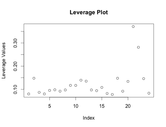
Next, we should look at leverage points. Here are the hat values for each point:
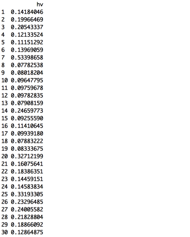
The leverage guideline that can help us identify leverage points is 2.5*((p+1)/n) = 0.4166667. There is one point that is isolated above this guideline:
Video #7 is “Harrison Ford Returns for Indiana Jones 5, Kanye & More,” a clip from MTV News that has very low predictor and response values.
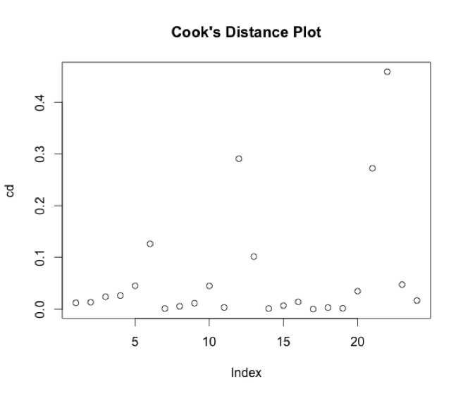
Next, let’s calculate Cook’s Distance values to identify potential influential points:
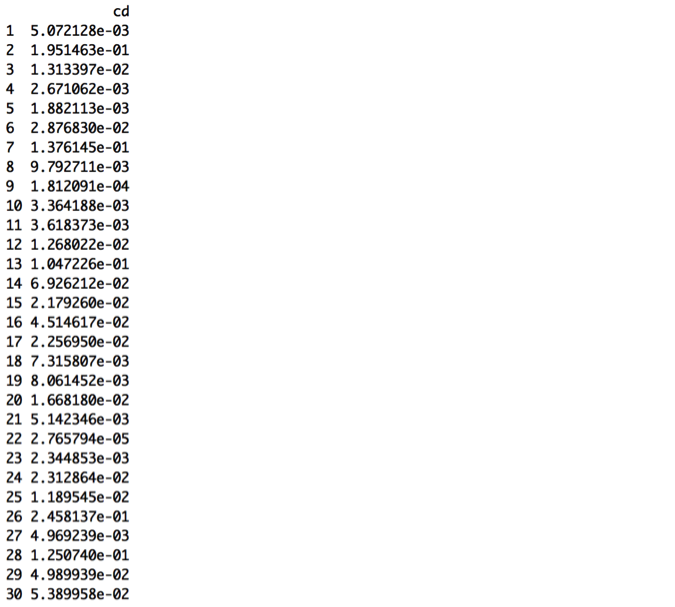
A general guideline is to use CD > 1 as a flag; however none of these values is close to 1. Another suggested guideline is to use CD > 4/n as a flag.[1] This guideline would be .13 for these data, causing us to look more closely at observations 2, 7, 13, 26, and 28.
[1] https://en.wikipedia.org/wiki/Cook%27s_distance
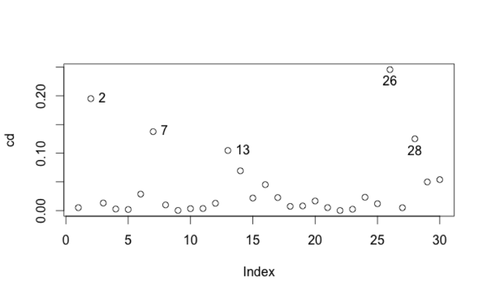 We’ve already identified 13 and 7 as potential outlier and leverage point, respectively. Points 2, 26, and 28 are, respectively:
- “#SpringStyle” – MTV
- “Should Religion Be a Part of Politics” – mtv braless
- “This week 03.17.16” – BET
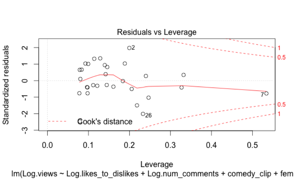
Looking more closely at a Residuals vs. Leverage plot, it seems like 2 and 26 are highly influential, especially given their higher standardized residual values. Video 28, while somewhat influential, I will leave be.
Let’s take a look at a new regression removing the outliers 2, 13, and 26, and the leverage point 7. Taking a look at the histograms and boxplots of the original variables, they all still look fairly similar to their previous distributions, and I’ll therefore log the right-tailed variables.
There still appear to be weak relationships between each predictor and the response variable, but perhaps it’s weaker now than before for Log.likes_to_dislikes.
Running a new regression (Model K) on this revised dataset yields the following results:
Indeed, the Log.likes_to_dislikes variable is no longer significant, and neither is Log.vid_length. R2 is somewhat improved, however, from about 90% in the original model to about 94% in this latest model.
The residual plots aren’t especially concerning:
But we should still look at best subsets techniques to evaluate whether we have overfitted the model by using all the variables, again, especially since two of the variables are not even significant.
AIC output:
AIC Corrected output:
Cp, Adjusted R2, AIC, and AIC Corrected subsets values suggest choosing 2 predictors: Log.num_comments and number_channel_subscribers. R2 suggests choosing all 4 predictors. Therefore, we should compare the results from Model K to a new model (Model L):
Model L:
Log.views = β0 + β1 x Log.num_comments + β2 x number_channel_subscribers
This simpler model, Model L, is preferable. We’ve gotten rid of the two insignificant variables without sacrificing any of the model’s strength of fit or strong significance.
Now let’s compare Model L to the constant shift model (Model M):
Log.views = β0 + β1 x Log.num_comments + β2 x number_channel_subscribers + β3 x comedy_clip + β4 x female_target.
The VIF values indicate that comedy_clip and number_channel_subscribers are, again, collinear, so we should choose one. As before, I will go with the comedy_clip variable.
This is a better model, as comedy_clip is now highly significant once again, but the female_target variable is insignificant, so I will also get rid of it as well.
Model O:
Model O is a constant shift model that should be compared to a pooled model using a partial F-test:
Indeed, Model O, the constant shift model, is a highly significant improvement. Comparing Model O to the full model, however, shows that the full model is not a significant improvement, given the high p-value for the t-test of the interaction variable:
Model O is still our best model of choice at this point. Let’s again take a look at residual plots to check on potential problems with our underlying assumptions:
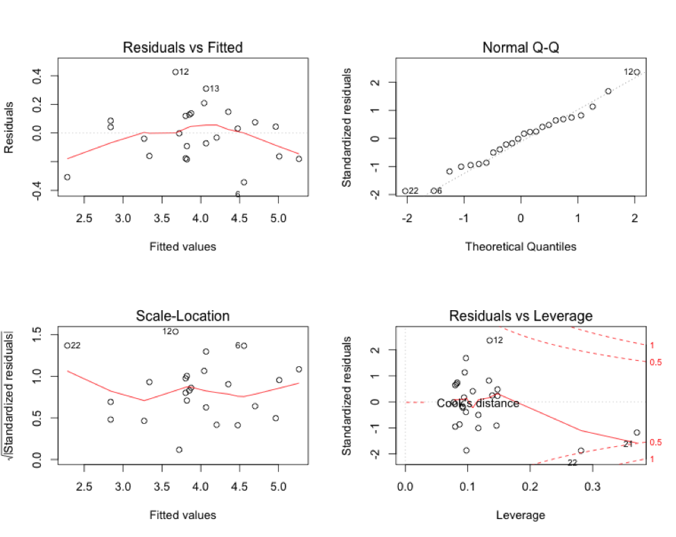
There are still some issues here with potential outliers and leverage points, particularly with points 12 (“Daily Show 3/17 in 60 Seconds” – Comedy Central), 21 (“TMNT” – Nickelodeon), and 22 (“This Week” – BET). Video 12 has an unusually high number of views for its number of comments, while video 21 has a very high comments number, along with unusually high views, and video 22 has unusually low views and zero comments. I think it’s possible that video 12 is one of the 5% of videos that are bound to be outside our rough predictive interval of 64% to 156% of the predicted value. We could consider taking out all three data points and running the regression again, but I think at this point we’ve exhausted most of the insight we could get from this data set.
CONCLUSION:
Using this one small data set, we examined the weekly viewership of videos posted by Viacom brands on a particular day, March 18, 2016. Using this data, we found that out of all the variables we recorded, much of it is potentially extraneous, aside from numbers of comments and whether the video is a comedy clip. In the end, we found that the best model had an R2 of 94%, meaning that 94% of the variability in Log.views could be explained by the simple model containing Log.num_comments and comedy_clip as predictors. These two predictors are highly significant, as is the overall predictive strength of the model. The coefficients imply:
- A 1% change in the number of comments a video has is associated with a 1.17 % change in video views, holding all else in the model fixed, and
- Comedy clips are associated with a 3.04 multiplicative change in views over non-comedy clips, holding all else fixed.
A rough prediction interval can be derived from the standard error of 0.19: 95% of the time, we should be able to predict views to within 64% to 156% of our best guess.
Overall, it’s not surprising that comments increase as views increase, as it seems intuitive that as videos gain popularity, people talk more about them, and then as people talk about videos, they also gain popularity through higher social visibility (Youtube comments often simultaneously show up on social media sites such as Google+). Comedy clips appear to have a larger impact on determining viewership in this data set than female targeted videos.
We would have to measure many more data set samples to determine whether these insights might be scalable outside of this small group of videos, however. Ideally, we’d have a large enough data set with which I could set aside some holdout data to test the performance of our chosen model. I will probably redo this sort of regression using a larger Youtube data set at a later date.